The Typewriter Betrays You: Reading the Secret Language of Stock-Style Brand Photography
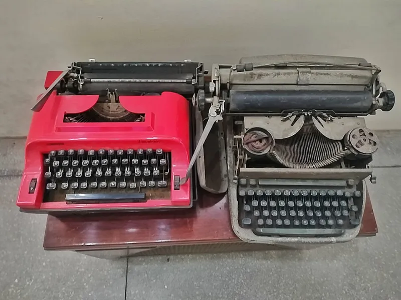
Photo: পাপৰি বৰা, CC BY-SA 4.0, via Wikimedia Commons
Somewhere in America, right now, a marketing team is finalizing a brand shoot. The mood board is polished. The budget is approved. And on the prop list, wedged between the fern and the exposed-brick backdrop, sits a vintage typewriter.
Nobody on the team uses a typewriter. Nobody on the team knows how. It doesn't matter. It has appeared in a thousand campaigns, and so it will appear in a thousand and one — an object borrowed from an era nobody lived in, signaling a creativity nobody practices.
The typewriter is not a prop. It is a confession. It says: we ran out of ideas at the mood board stage.
Fifty Milliseconds of Judgment
The research on first impressions of imagery is unforgiving. Studies in visual cognition suggest that viewers form judgments about a photograph — and by extension, the brand behind it — in roughly fifty milliseconds. That is less time than it takes to read this sentence. It is certainly less time than it takes to notice the typewriter consciously.
But your audience notices it unconsciously. And what they register is not "quaint" or "charming." What they register is generic — the visual equivalent of hold music.
"Audiences don't read photographs," one veteran art director told us. "They recognize them. The moment a viewer thinks 'oh, this again,' you've lost. Recognition of a cliché is a tiny, instant tax on trust."
The Cliché Catalog
Every visual cliché is a sentence your brand never intended to speak. Consider the greatest hits:
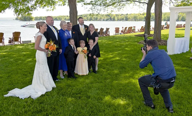
The staged laughter. Two colleagues mid-guffaw over a laptop, pointing at nothing. Intended message: we're fun. Received message: we have never once laughed in this office.
The glass conference room. Intended message: transparency and modernity. Received message: we watched the same tech commercial you did.
The reclaimed-wood wall and Edison bulbs. Intended message: artisanal authenticity. Received message: we hired the same set stylist as our three competitors.
The typewriter, the rotary phone, the film camera. Intended message: old-school craft. Received message: nostalgia is standing in for substance.
Marketing psychologists describe this as semantic leakage — meaning that escapes from the image regardless of intent. The problem is not that these objects are bad. It's that they are unchosen. They were inherited, not decided. And audiences, without knowing a single rule of composition, can smell the difference between a photograph that was decided and one that was assembled.
Assembled vs. Authored
The distinction is the whole game. An assembled photograph is a collage of borrowed signals: add laughter, add brick, add warm bulbs, stir. An authored photograph begins with a question — what is actually true about this company? — and lets every element answer it.
When we asked art directors how they spot the difference, their answers converged on a single principle: specificity. A real workshop has a specific kind of dust. A real founder has a specific way of standing when she's thinking. A real product has a specific reason it's photographed at a certain angle, in a certain light.
Clichés are the opposite of specific. They are the lowest common denominator of an entire genre — which is precisely why every brand that borrows them starts to look like every other brand that borrowed them first.
A Checklist for Brands Who Mean It
Before your next shoot, run your plans through this filter:
-
Interrogate every prop. For each object on the list, ask: does this exist in our actual working life? If the answer is no, cut it. A real coffee ring on a real table says more than a spotless vintage typewriter ever will.
-
Kill the directed laugh. If you want warmth, capture warmth — a genuine moment between people who actually work together. Staged laughter is the single most expensive lie in commercial photography, and the easiest to see through.
-
Photograph your actual environment. The glass conference room is a set. Your real space — with its quirks, its clutter, its specific light — is a location. Audiences forgive imperfection; they do not forgive fake.
-
Name the emotion before the frame. Not "candid" or "professional" — those are genres, not feelings. Try: capable, unhurried, precise, proud. If you can't name the emotion, the photographer can't light for it.
-
Ask what the image would say with the logo removed. If the answer is "nothing in particular," the photograph is decoration, not communication.
The Verdict of the Frame
There is a reason the most enduring brand photographs — the ones people remember a decade later — feel less like advertising and more like evidence. They were authored by people who knew what they wanted to say and refused to borrow the vocabulary.
The typewriter will keep showing up in mood boards. Let it. Your brand's job is to be the photograph that makes the typewriter look like what it is: a prop in search of a story.
Say something deliberate. Every frame is already talking.